You might have noticed a change while searching for something on Google from your mobile. Well, Google has changed the design of its Seach on design.
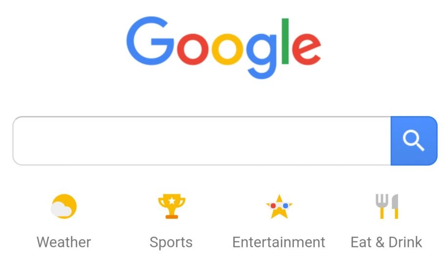
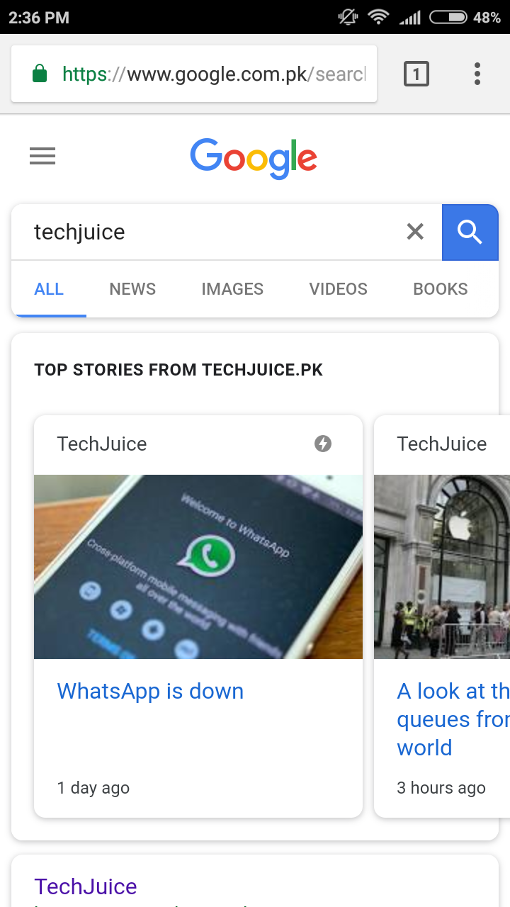
Google continuously keeps changing the design for its search on mobile and desktop. It started to test a rounded design months ago with a few number of users but it is not rolling out the new design for everyone. To test the design, just search for anything on Google in any browser on your mobile phone. You’ll notice that even the search bar on the Google home page is rounded now. When you start typing something, the predictive text will also appear in a rounded fashion.
Scrollable sub cards also got the rounded design. Like you can see in the picture above that the top stories section has the same design. Moreover, the light grey background has also been changed to completely white now. The rounded design is currently available on mobile browsers only. Google app has not gotten it yet but we might soon see the design on the app as well.
If you haven’t received the design yet, you might have to wait a few more days at it is a gradual rollout and may take some time to reach everyone.
The post Google Search design changes on mobile appeared first on TechJuice.


