It’s been a while since Samsung launched a super exciting product which caught everyone’s eye. While the last two years have seen iterative changes from the South Korean tech giant in its flagship line-up, this year, however, Samsung launched something special to celebrate the tenth anniversary of the uber-popular Galaxy S series.
The Galaxy S10 is Samsung’s latest inclusion in their highly-rated Galaxy S series and this year’s S10 has without a doubt set some new standards for the smartphone industry. While software preference may vary from person to person, one thing is for certain and is agreed upon by fans of both iOS and Android, that Samsung has definitely aced the hardware and design department.
Design
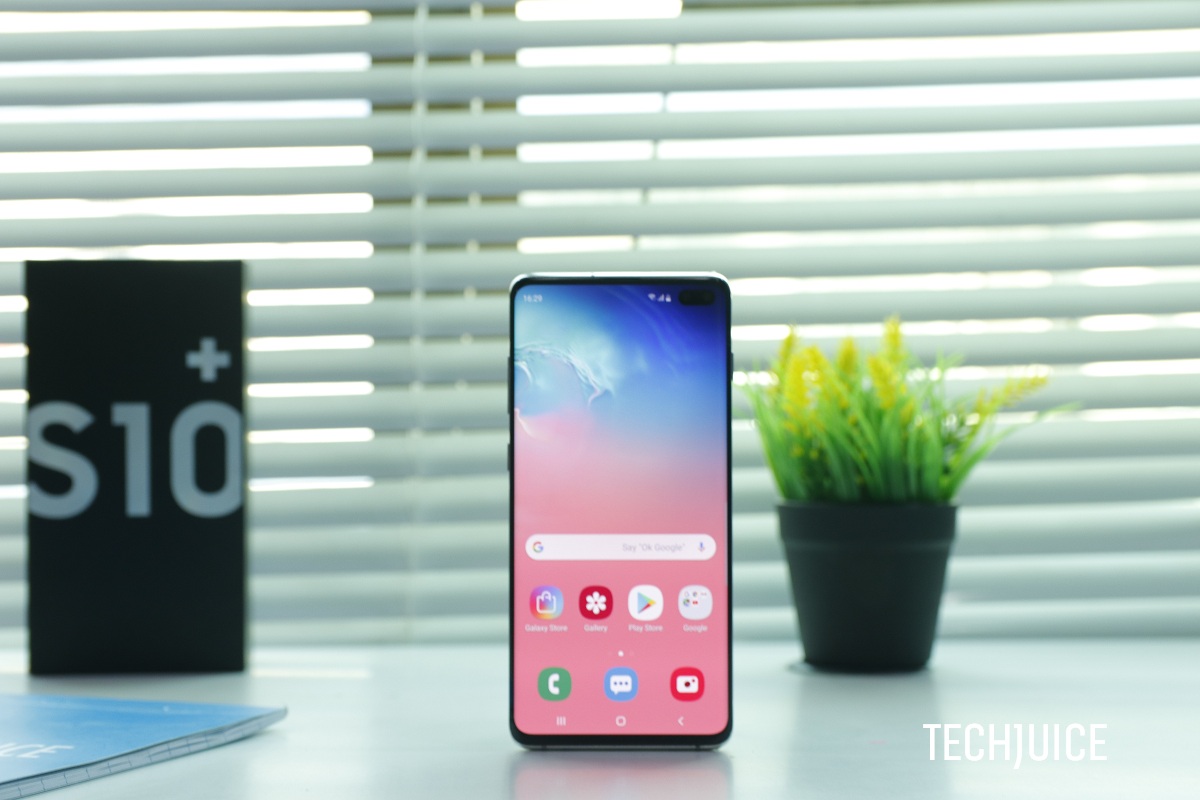
Sandwiched between metal and glass, the ultra-premium Galaxy S10 Plus stands tall at 6.4 inches. The phone is dominated by the huge vibrant Super AMOLED display coupled with Samsung’s distinct curved edge design which melts sideways. A big advantage of this curved design is that it makes the handling of a huge device such as S10 a lot easier since the curved edges narrow down the wideness of the phone which makes it easier to hold. The overall built quality of the phone is pretty premium but the phone is surprisingly very light.
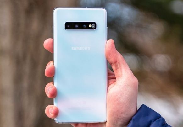
The placement of the buttons, however, was pretty poor this year. The power button of the S10 Plus is unusually high which makes the handling of the phone a bit tough and requires some single-hand acrobatics. Interestingly, the Bixby button is placed at a very inconvenient position which makes it a recipient for a lot of accidental touches, therefore making the overall user experience a bit frustrating.
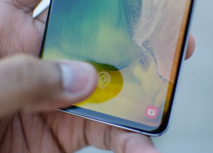
Another change which Samsung made in this year’s Galaxy S10 Plus is the all-new ‘in-display fingerprint reader’. While it’s no way near as convenient as a traditional physical fingerprint sensor, it was still pretty good as per my testing. A better way to use the new in-display sensor is to first enable the ‘double tap to awake screen’ feature. This will help you to figure out the right position to place your thumb on the screen. Over time the right position of the in-display fingerprint scanner will be locked into your muscle memory which will eventually make the overall experience more ergonomic and seamless.
Display
Samsung is known for making the best screens for mobile phones, but with the Galaxy S10 lineup, Samsung has hit a homerun. For starters, the Galaxy S10 Plus has a “Dynamic AMOLED” display with Quad HD+ resolution in a 19:9 aspect ratio. While the screen looks amazing on paper, it is something that you need to see in person to appreciate it properly.
The Galaxy S10 Plus is the world’s first and for now, the only mobile phone (along with the S10 and S10e) to use Samsung’s Infinity O displays. There are phones with hole punch screens but the Galaxy S10 lineup have the honor of being the only phones to have a hole punch AMOLED display.
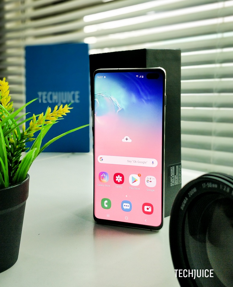
Hole punch designs strike a compromise in between the controversial notch and the unreliable mechanical sliders like the Oppo Find X. So the design allows Samsung to provide a more immersive experience at a little cost. In fact, the hole punch design has kickstarted a new wallpaper trend, where creative artists are trying to cover the camera with cool characters like Baymax from Big Hero 6. So companies continue to figure out how to make a true edge to edge displays, in the meantime, you can have fun with cool wallpapers.
While some might not like the hole punch design, there is no debate over the fact that the Galaxy S10 Plus has the best mobile phone display. Its screen to body ratio of 88.9% might not be the highest but is still impressive. From the slightly curved edges to great color rendition, you are bound to get lost in your content.
In our testing, the screen proved to be plenty bright for outdoor usage. We could easily use it in broad daylight. The display also able to reduce its brightness dramatically so it won’t hurt you when you’re using it in your bed. Apart from that, the display has excellent contrast and color reproduction, in fact, this the only phone with HDR10+ certification.
Specifications
As always Samsung’s flagship phones are feature-rich and are powered by top of the line specifications, this year’s Galaxy S10 Plus is no different in that regard and in fact, was the first Samsung Flagship phone to feature a whopping 1TB of internal storage in one of the S10 Plus variants. The phone included:
- 6.4-inch QHD+ AMOLED screen
- front dual-camera setup (8MP + 10MP)
- triple-lens rear-camera setup (16MP f/2.2 ultra-wide lens, a 12MP f/2.4 telephoto lens and a 12MP lens)
- Snapdragon 855
- 8GB + 128GB or 8GB + 512GB or 12GB + 1TB
- 4,100mAh battery
- reverse wireless charging
Camera
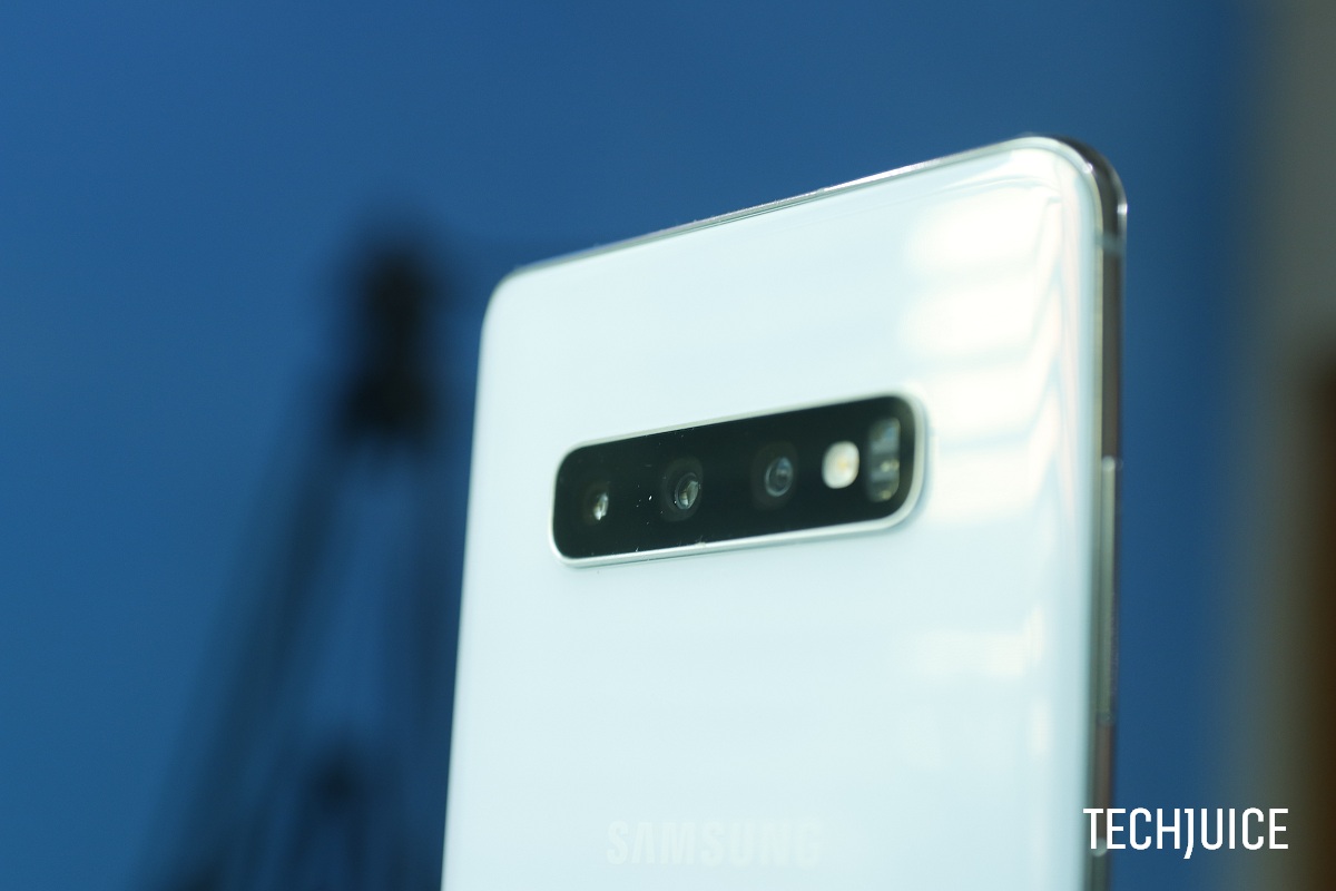
Samsung’s smartphone camera has evolved a lot over the years for the better. With punchy and saturated colors it has always remained among the top picks for the masses and has been particularly popular in the Asian market. This year’s Galaxy S10 was the first Galaxy flagship to feature a triple camera set-up. The camera set-up included:
- Triple-camera setup
- Primary: 12Mp sensor with 1.4µm pixels and 26mm-equivalent, f/1.5–2.4 aperture lens, Dual-Pixel AF, OIS
- Ultra-wide: 16Mp sensor 1.0µm pixels and 13mm-equivalent, f/2.4-aperture lens
- Telephoto: 12Mp sensor with 1.0µm pixels and 52mm-equivalent, f/2.4 aperture lens, PDAF, OIS
- 2160p/60fps (1080p/30fps at default settings)
Triple rear-camera
The rear camera was very good as usual with all Samsung flagships, it delivered good target exposure in most situations, but where the S10+ really beats the competition is in dynamic range, with a noticeably wide range (thanks to that ultra-wide angle lens) than other high-end phones. S10 Plus color rendering was also good under most conditions, with accurate white balance.
However, a disappointing thing to notice was the absence of a ‘night mode’ feature which caused the S10 to lag behind its competition, considering that Huawei and Google have already introduced their versions of ‘night mode’ which take considerably better shots than Galaxy S10 Plus during night time and in low light conditions. The portrait mode or as Samsung calls it “Live focus” mode was good but still needs a lot of improvement in edge-detection considering the superior computational photography of Apple and Google.
The video mode, however, was very impressive and dare I say the best among all Android phones owing to its superb video stabilization, excellent audio quality, and that ultra-wide angle lens.
Front-camera
While the overall experience with the front-camera was pretty good, however, the same problem that has plagued the selfie camera of generations of Samsung flagship phones still persists. The images, in general, were soft, especially in indoor conditions where the sunlight was not accessible. Furthermore, the “live focus” mode of the selfie was not up to the mark with poor edge-detection which gives the overall image a very fake look. Coincidentally, the same problem persists with all of the Chinese flagships as well. Google and Apple seem to be the only two companies to have sort this issue out owing to their superior computational photography.
Software
Samsung over the years has worked a lot on the refinement on its software. From the days of frustrating and lagging experience of TouchWiz to the much improved One UI, Samsung’s software has undergone a lot of changes. The current One UI on Samsung is by far the best Samsung skin that I’ve experienced. It’s still not as fluid as the vanilla version of stock Android on Google’s Pixel devices or as fast as OnePlus’s Oxygen OS but it is still an impressive improvement as compared to TouchWiz.
The new gesture-navigation
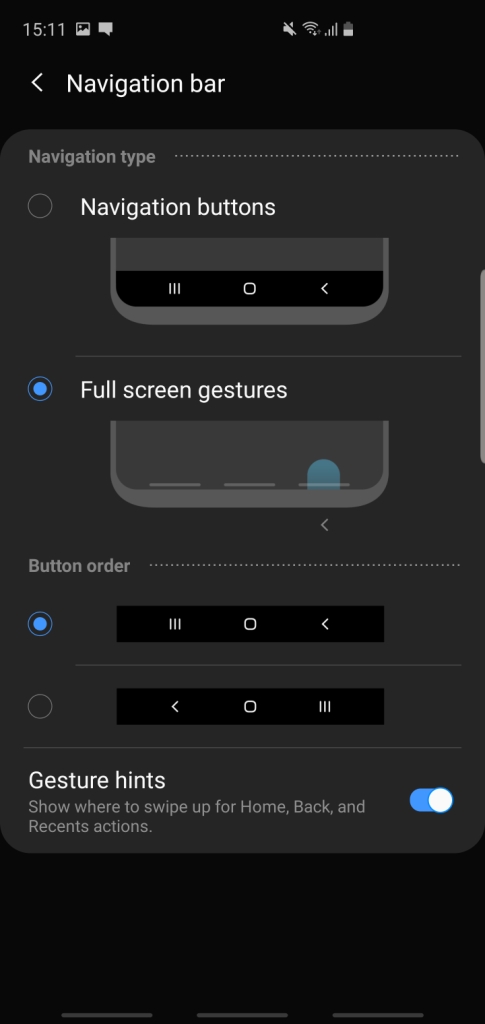
Samsung like other Android manufacturers has also implemented the new gesture-navigation in its flagship devices. However, unlike Google’s implementation of Gestures, Samsung has tweaked the software a little to make the gesture navigation a bit better. As seen from the screenshots provided below, Samsung completely removed the need of button when opting for a ‘Full-Screen gestures’, therefore viewing more screen, unlike Google’s implementation which is a mess and is divided between buttons and gestures. The three horizontal bars shown below are used for navigating Android 9.0 coupled with Samsung’s One UI.
Powerful Processor
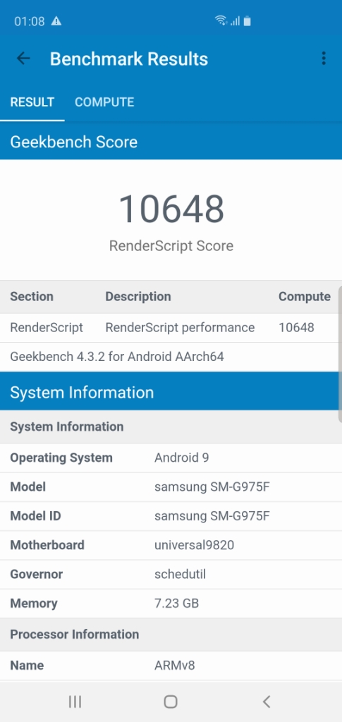
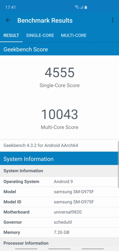
Depending on the region from where you are buying your Galaxy S10 Plus, it will either be packed with Qualcomm’s 7nm chip Snapdragon 855 or Samsung’s in-house built 8nm chip, Exynos 9820. Other than the USA, the rest of the world gets Samsung’s Exynos chip embedded in their Galaxy flagship devices.
As you can see the Exynos 9820 performs much better than its Snapdragon in Single score in the Geekbench 4 test, however its lags behind the Snapdragon 855 in Multi-Core score. The Exynos 9820 also performs and scores considerably well in the RenderScript score as well.
Battery
Another big improvement that this year’s Galaxy S10 Plus had over the last year’s S9 Plus is the change in battery size. Despite being lighter, the S10 Plus packs a 4,100 mAh battery which is an engineering marvel in itself. The S10 Plus easily lasted more than a day on full brightness with the display settings set at WQHD (2960 x 1440).
Dark Mode
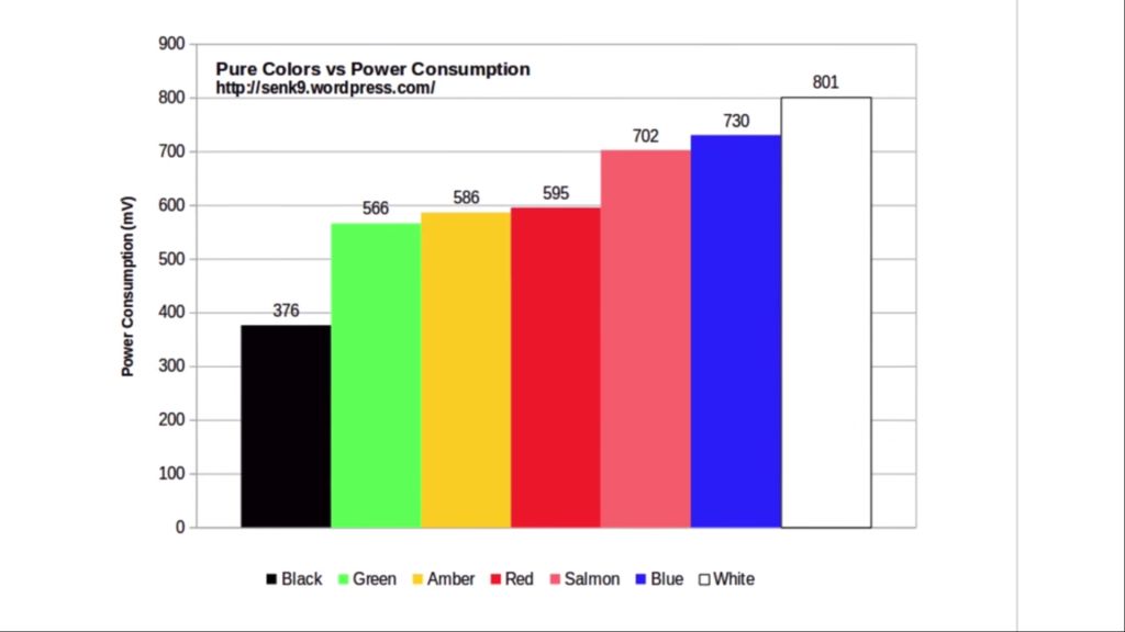
The availability of system-wide dark mode only made the experience a lot better, since the dark mode switches off the pixel in the dark(black) areas of the screen thanks to the OLED technology. As mentioned the black display on OLED panel uses considerably less battery compared to the white pixel. The following graphs below shows the significant amount of power consumption used by the ‘white color’ compared to black color.
As seen from the graph, the difference in power consumption between the two colors is quite significant. This is a major reason why Google and Apple are working on dark modes for the next iteration of their OS and why Apple will be completely shifting to OLED displays in 2020. Since LCD displays light up the entire display panel compared to OLED panels which completely turn off the black areas on the screen.
An interesting experiment that I tried with the dark mode was using it to display Reddit’s homepage for two hours. After two hours of displaying Reddit’s homepage in normal (white) mode and then in dark (black mode), the difference in battery drain was quite significant. Using the normal mode, the Galaxy S10 Plus drained down to 80% from 100% while in dark mode the battery only drained to 92% from 100%. This makes a visible change in the battery consumption of the device and considering the S10 Plus already has a very good battery, things can only get better. A clear indication of why the dark mode might be the preferred layout for a lot of apps in the near future.
Conclusion
Titled by The Verge as “The Anti-iPhone” the S10 Plus is the only flagship smartphone to have escaped the infamous notch design while providing an excellent screen to body ratio and retaining the ‘soon to be obsolete’ headphone jack. The S10 Plus is truly in every way the opposite of the iPhone. While the S10 Plus definitely has its downsides and needs some improvements (especially in the software department) the phone still has no outright competitor in the Android world and has outperformed most of its competitors. As of April 2019, the S10 Plus has ‘set the bar’ to a pretty high standard and has rightfully reclaimed the “King of Android” throne, for now!
The post Samsung Galaxy S10 Plus review: Reclaiming the throne appeared first on TechJuice.

