Back in 2017, Microsoft added some Fluent Design elements to Windows 10 which mainly included Perspective parallax, Conscious controls, Connected animations, and few more. Recently, it introduced a new screenshot tool for the OS and now it seems the company is bringing more such Fluent Design elements, as today at Microsoft’s Build 2018 developer conference, the firm showcased plenty of upcoming design features for Windows 10.
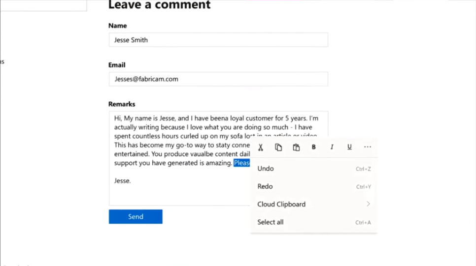
Microsoft will be adding something new, a command bar flyout that basically will show you inline tools and options, making the access efficient while also saving the space at the top where such options are currently present. OneNote would be the first app to come with this design element.
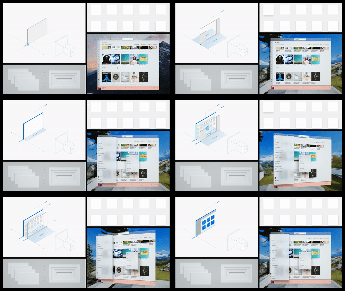
Next up, we have a new feature z-depth that would make the apps feel like having more depth in certain cases. Not to mention, Microsoft is adding new shadow effects as well.
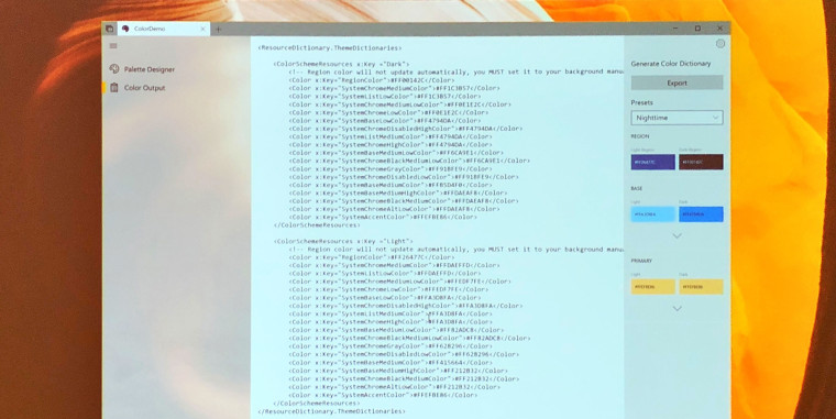
Furthermore, the company is now allowing developers to manage the colors inside an app, making it flexible to set the overall theme as per the brand’s color scheme.
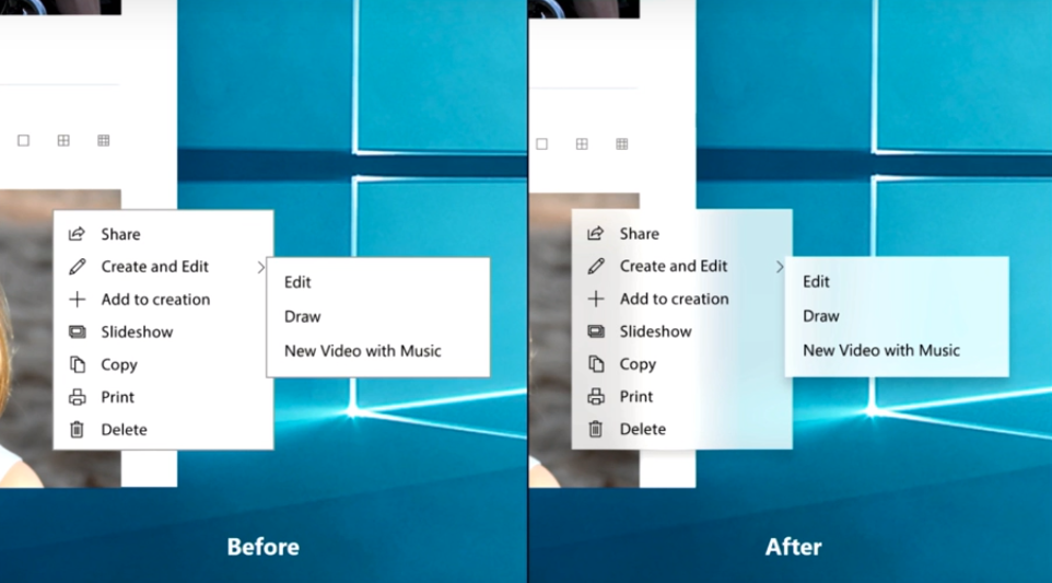
The new Acrylic feature is also there on the list which will add transparency to the transient UI such as pop-up menus. Microsoft this time, is quite focused on making the Universal Windows Platform (UWP) apps adaptable to all kinds of input, whether touch screens or keyboard and mouse as presently the apps are designed more for touch inputs.
There were some other features announced as well, all in the session called, ‘Fluent Design: Evolving our Design System’ and it was said that these design updates would be rolling out this year. Also that the complete session will soon be posted to Microsoft Build website. If interested, be sure to check that out.
Are you excited for upcoming Fluent Design elements in your Windows 10? Let us know down in comments. For more news on technology, keep following TechJuice.
The post Microsoft unveils new Fluent Design elements for Windows 10 coming this year appeared first on TechJuice.


